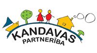
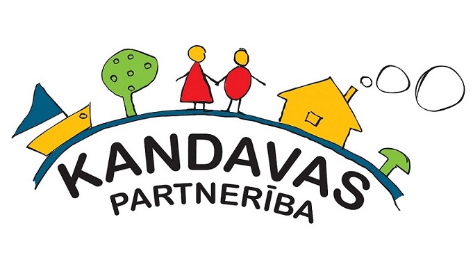
The logo contains several symbols that describe the territory of the Kandavas Partnerība:
An arc-shaped element – a base that symbolizes a bridge, at the same time water (river). On the bridge/water are the other elements of life.
People - symbolize cooperation, love, unity...
Sailboat - symbolizes the pursuit of one's goal, direction, dynamics...
Tree - symbolizes the fruits of labor, development, strength...
House - symbolizes family, prosperity, stability...
Mushroom - a flood of good deeds every year:)
Technical parameters of the logo of the association "Kandavas Partnerība":
Pantones and the CMYK division of specific pantones in the logo:
Black – 426C (C-0.0 M-0.0 Y-0.0 K-100.0)
Yellow – 116C (C-0.0 M-15.0 Y-94.0 K-0.0)
Bright Green – 376C (C-56.0 M-0.0 Y-100.0 K-0.0)
Red – 179C (C-0.0 M-79.0 Y-94.0 K-0.0)
Dark Blue – 633C (C-91.0 M-0.0 Y-15.0 K-27.5)